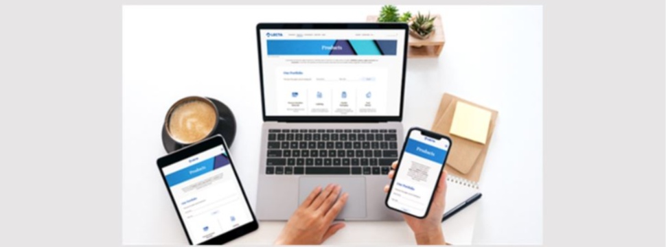
Lecta Unveils a Fresh New Look & Feel for Its Corporate Website
News General news
New sustainability content and streamlined navigation for an improved user experience.

Lecta strives to innovate with its product portfolio as well as in how it communicates and delivers content to its stakeholders. The new version of its corporate site is a reflection of this with updated content, improved access to its product portfolio and an overall improved customer experience.
The site offers the latest in usability with a clean, practical design, a focus on mobile-first and larger type-face for accessibility. Product categories and ranges are represented with pictograms for quick access. And navigation has been redesigned in several key areas to make it easier to get to the product, sustainability, news, investor or corporate information you need.
In addition, the Sustainability section has been expanded and featured our current goals, our most recent performance indicators, as well as upcoming challenges as stated in our latest Environmental Report.
All content on the Lecta website is available in English, French, Italian and Spanish.
We are proud and excited to introduce you to our new online presence. We invite you to visit www.lecta.com as we continue on our path of continuous improvement, innovation, responsibility and growth.


